UC Mobile
Building a Scalable Design System
Role
Sr. UX Designer
Team
7 People
Timeline
Nov 2024 – Feb, 2025
As a Senior User Experience Designer, I developed a comprehensive design system for the University of Canterbury's student mobile application. This app was a central resource for students to access information and tools throughout their university journey. The design system ensured consistency and scalability for a quickly evolving product that was central to the university’s digital strategy.
The Problem
The newly developed app lacked a cohesive design system, which led to several challenges. There was no clear documentation for the final design and styles, causing inconsistencies between design and development and leading to misaligned user experiences. The product was also worked on by numerous designers leading to mixed files and no single source of truth. As this was growing into a core business unit, the app required a scalable, future-proof solution.

The Solution
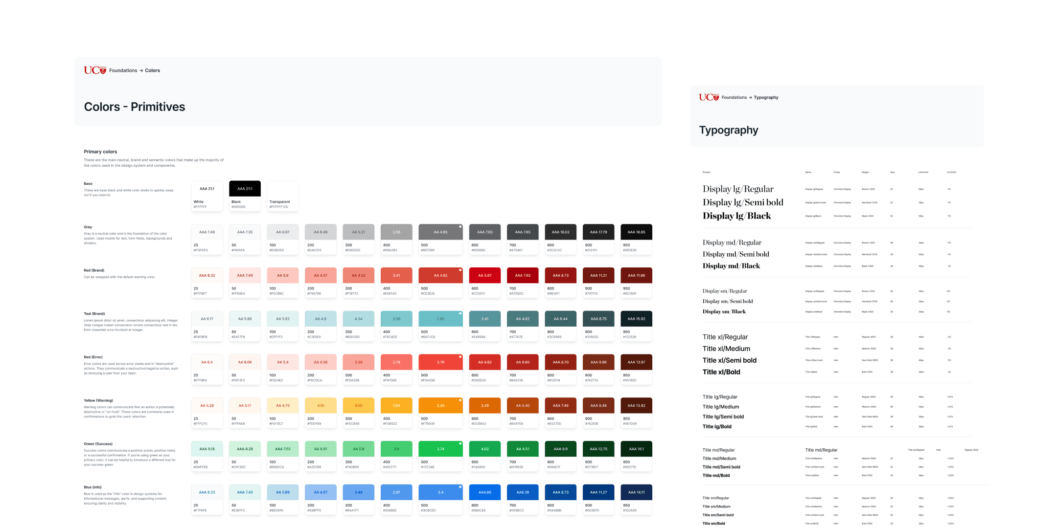
I conducted a thorough audit of existing design styles, components, and patterns in the app. This process revealed gaps and inconsistencies between design and development. An extensive component library was built out utilising new colour, spacing and typography tokens.

The design system was published as a Figma library, making assets easily accessible and significantly reducing time spent on new designs. Boolean and variant component states were utilised to streamline workflows. Extensive testing was conducted to meet WCAG standards, ensuring accessibility across colours, typography, and interactive elements.
Design Token Architecture
I developed a robust token architecture to define and manage design styles, including colours, typography, and spacing. The system leveraged simple naming conventions and categorisation, ensuring scalability as the app evolved. Additionally, an atomic UI structure was implemented to organise the component library effectively.
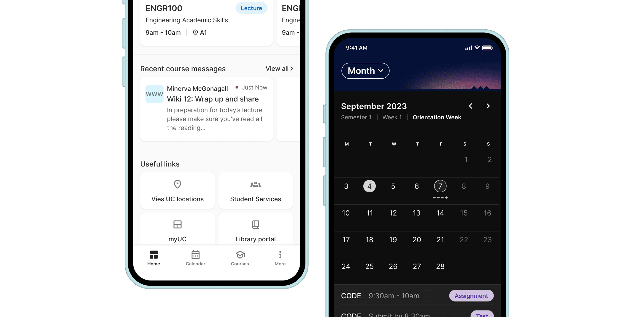
The token-based design system enables a more efficient approach to managing dark mode, allowing seamless transitions between light and dark themes across all designs. Unlike the previous system, which relied on component variants and primitive colours, often resulting in inconsistent conversions, the new system allows for instant previews of light and dark mode screens. This was crucial for the app as it used dynamic dark mode, automatically transitioning during morning and evening hours.


System Integration
After establishing the design system in Figma, I collaborated closely with developers to build an end-to-end release process. This included maintaining up-to-date documentation through Storybook, ensuring consistency across all mobile and web applications.

The Results
The new design system provides clear guidelines for UI components, creating a solid foundation for the team. While still evolving, it has improved collaboration between designers and developers with helpful documentation and a shared Figma library. Using token-based architecture, global updates are easier, integrating with Storybook to ensure scalability for the future.