ConnectUC
International Agent Portal Refresh

Role
Sr. UX Designer
Team
7 People
Timeline
Jan 2025 – Apr, 2025
ConnectUC is the university’s portal for agents to submit international student enrolment applications. However, the platform’s outdated design and clunky user experience caused frequent errors, incomplete submissions, and agent frustration. This often led to lost enrolments, while internally the admissions team was overwhelmed by duplicate submissions and constant queries.
My Role
As the Senior UX Designer, I led the discovery and design over a 4 month period. I conducted user research, mapped out user flows, and created prototypes using Figma, Miro and Azure DevOps. Collaborating closely with business analysts and developers, ensuring the final product addressed both user feedback and business requirements.
Challenges
Agents lacked visibility into application statuses, frequently made input errors, and found the dashboard difficult to navigate. As a result, support teams were overwhelmed with queries and duplicate applications. Since agents submit numerous applications on behalf of students, a poor user experience can lead them to favour other universities — resulting in lost opportunities for the University of Canterbury.
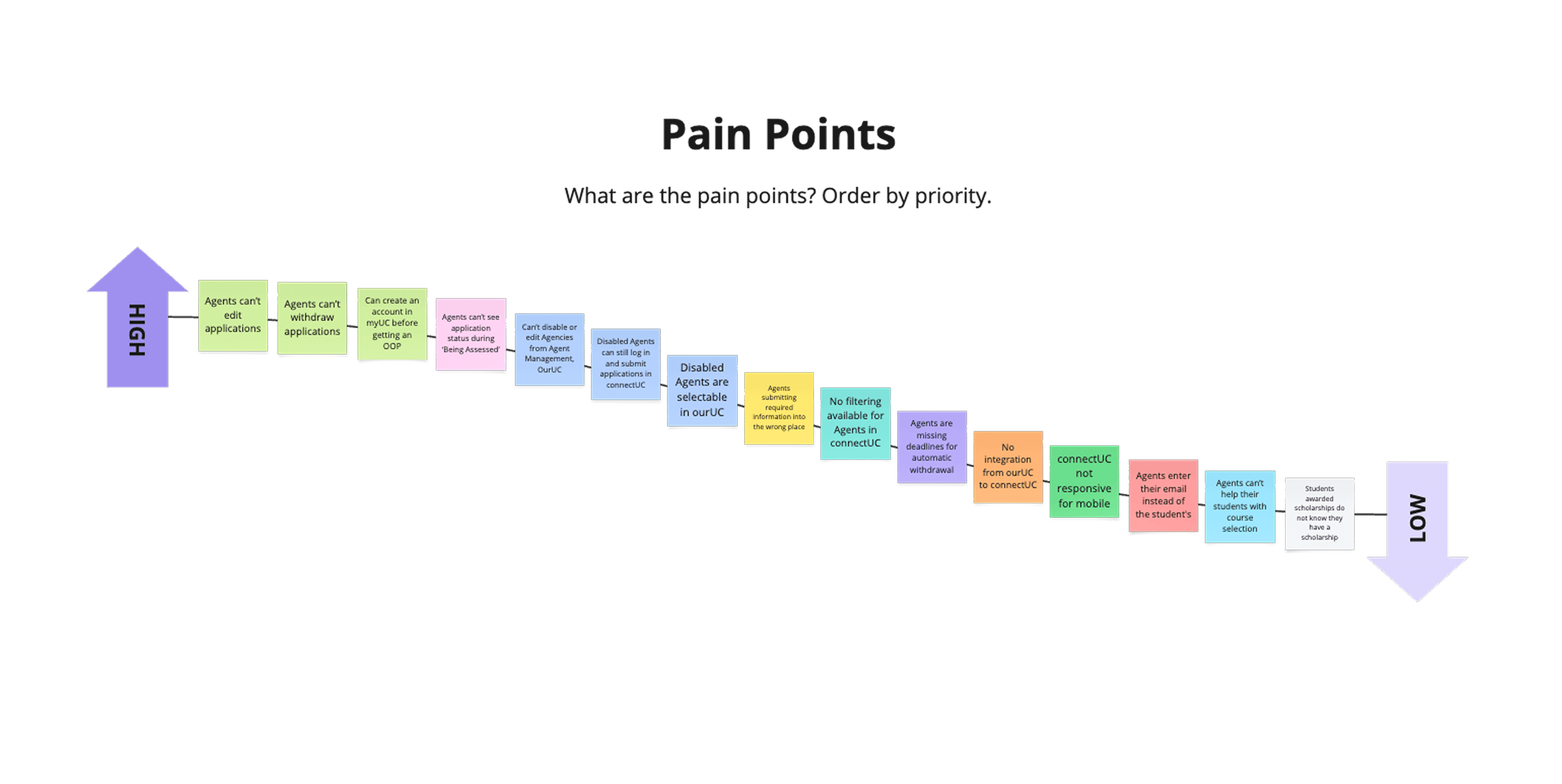
Discovery
We began with user research to validate key issues, using the MoSCoW method to prioritise business requirements and consolidating user feedback into key themes and user stories.
A recurring theme was that the outdated UI contributed to frequent user errors. During workshops with the admissions teams, we uncovered a common mistake, agents were mistakenly entering their own details instead of the student's. An in-depth UX review of the application form revealed that confusing microcopy, particularly the use of possessive pronouns, was contributing to this issue. We revised the language around input fields to reduce ambiguity and improve user understanding.

Agent Application Forms
The enrolment flow was redesigned to simplify the display of information incorporating better content grouping, enhanced hierarchy and contrast, clearer microcopy, and a progress stepper to modernise and improve the user experience.

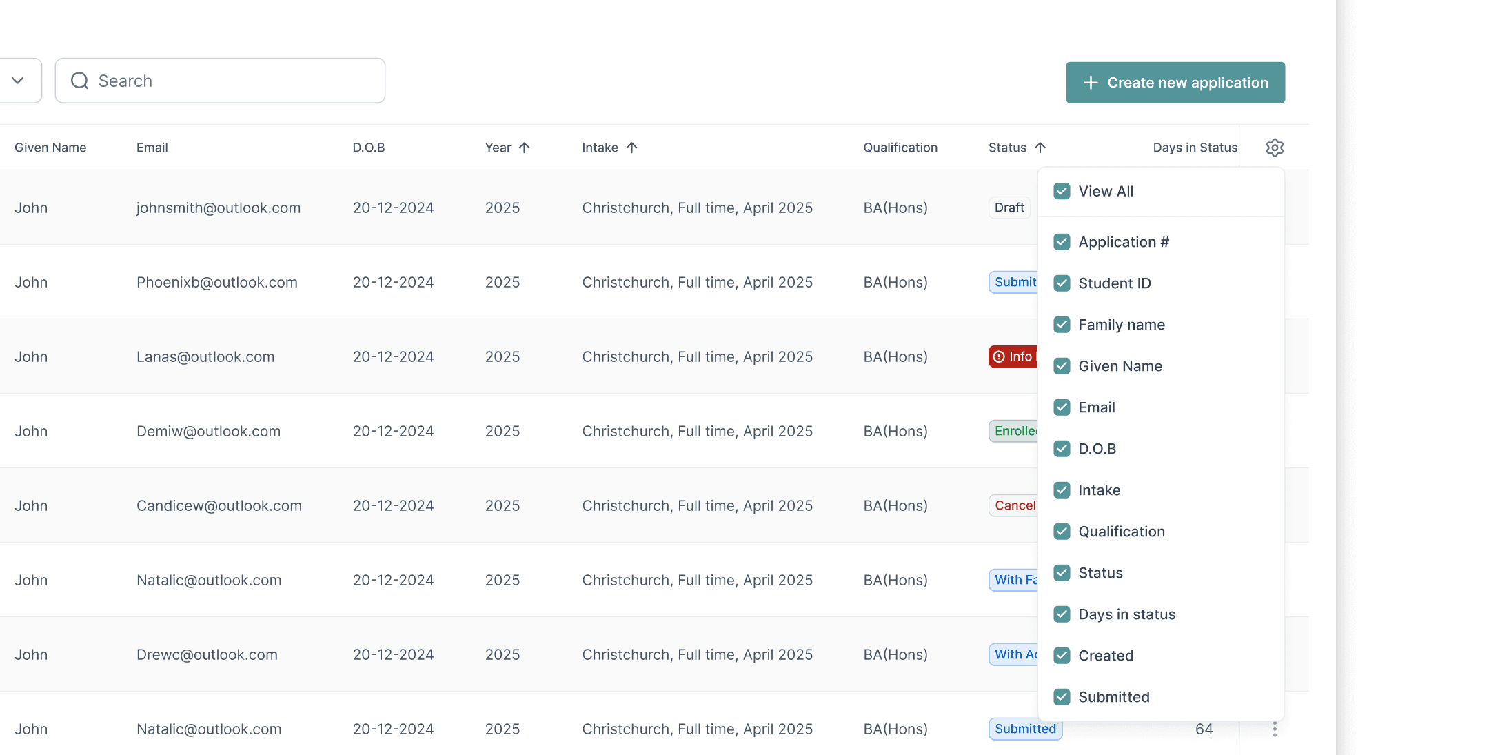
Agent Dashboard
The agent dashboard was redesigned addressing user needs, giving the agent more control with new filter and search options. Previous usability issues were addressed to ensure all content is visible, allowing for adjustable column widths and a side scroller to prevent information being truncated. The new dashboard utilises the full width of the screen to maximise real-estate and give content more room to breathe, reducing clutter.


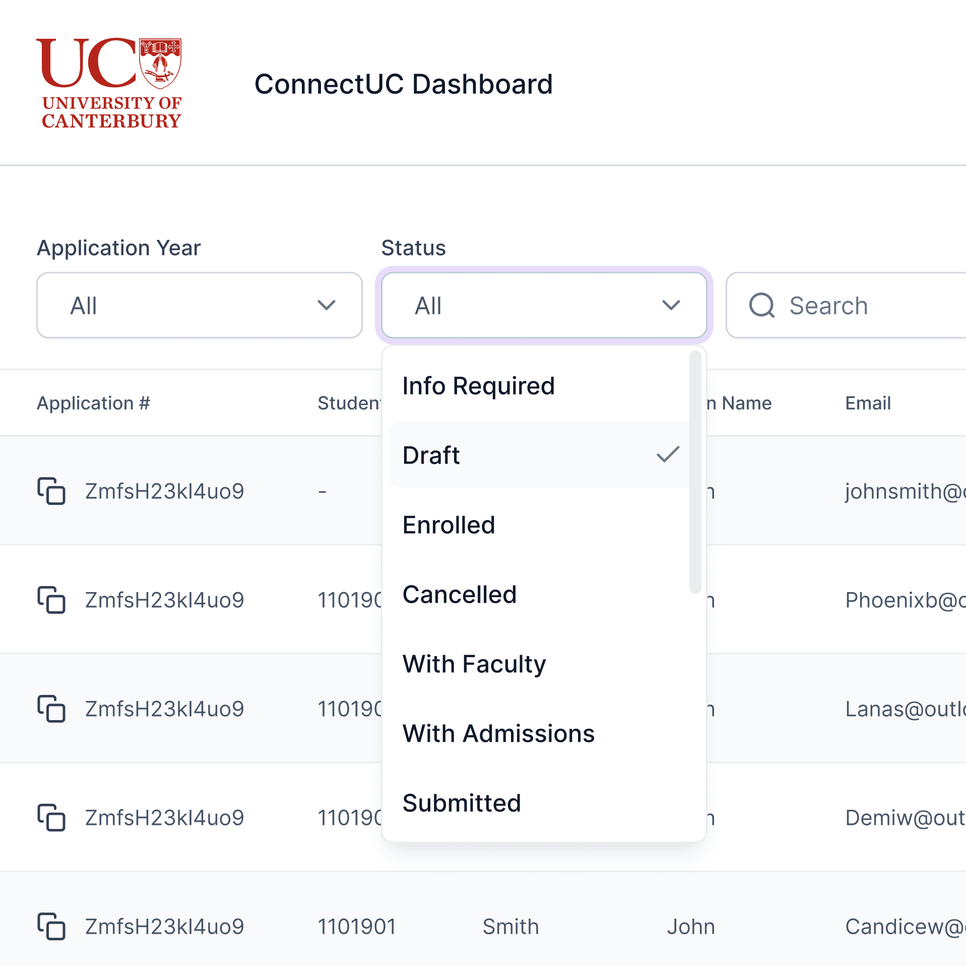
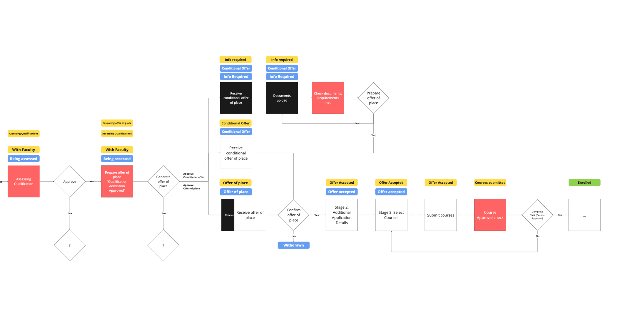
Status Improvements
To address the need for agents to track the progress of their applications, we reviewed the use of status pills. User flows were mapped to understand the enrolment journey across agents, students, and admissions teams, ensuring accurate updates were provided at each key stage. Additionally, we refined the UI to improve status hierarchy—placing greater emphasis on actionable statuses like ‘info required’, which were previously overlooked or ignored.

Delivery
Initial designs and prototypes were created and validated with stakeholders. We conducted workshops with product teams to identify technical constraints and align on expectations. Following this, we defined EPICs and features, and developed a delivery plan through Azure DevOps.
The redesign addressed over 49 user stories, resulting in a modernised, more intuitive user experience. Improving the agent experience is expected to boost international student leads and support the University’s recruitment goals as changes are released.