Overview
Our clients' dairy production mobile application underwent review to address usability issues. Through conducting UX research, we developed a new user-centered design, implemented a modernised GUI, and introduced a comprehensive design system. These improvements resulted in an improved user experience, leading to increased user adoption, strengthening our clients market share.
My Role:
Design Lead
Timeframe:
4-6 Weeks
Tools:
Figma, Miro, Adobe
Problem
Despite offering comparable functionalities, clients were opting for competitors' solutions due to perceived better usability and design. In response to customer feedback, our client asked us to address usability concerns for their dairy production mobile application. Key areas of improvement encompassed outdoor optimisation, user-flow refinement, and GUI modernisation.
One of the main challenges was working within an existing Xamarin framework as well as client budget restraints that meant we couldn’t stray too far from the original architecture and functionality.
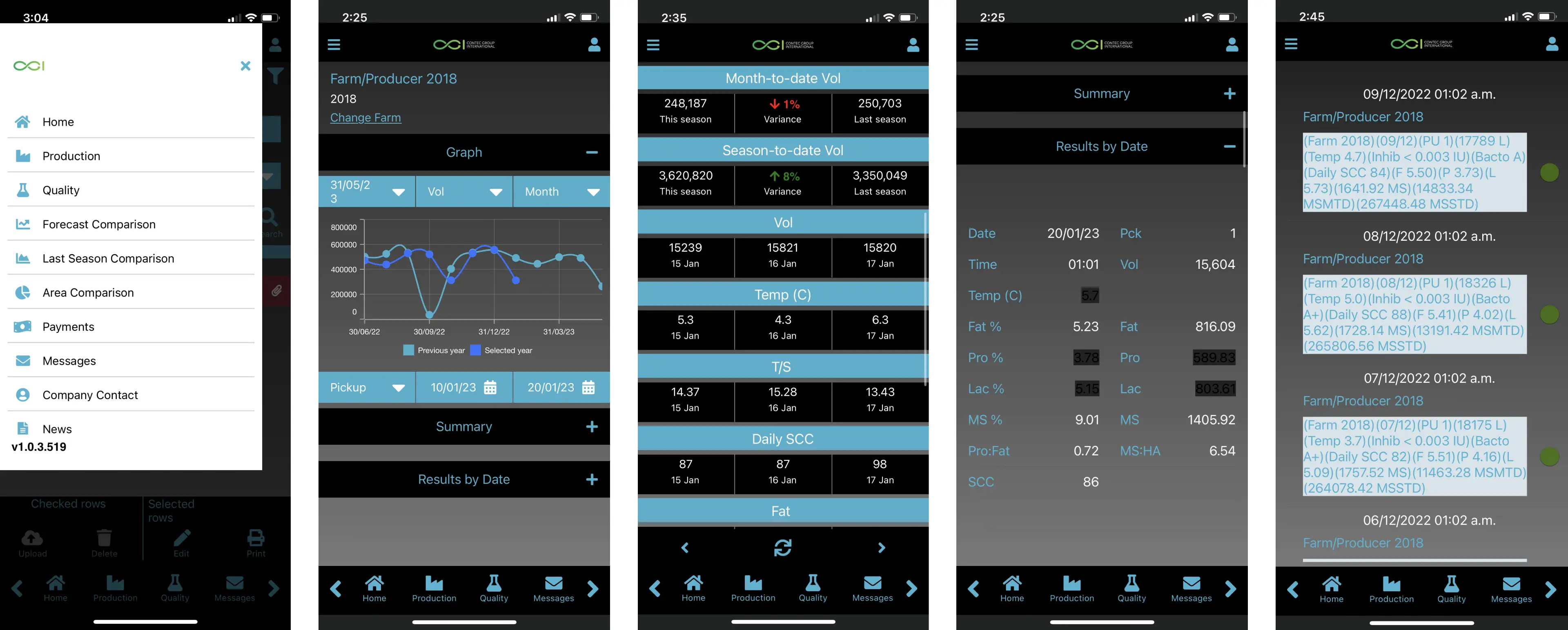
Before screens of the application
Solution
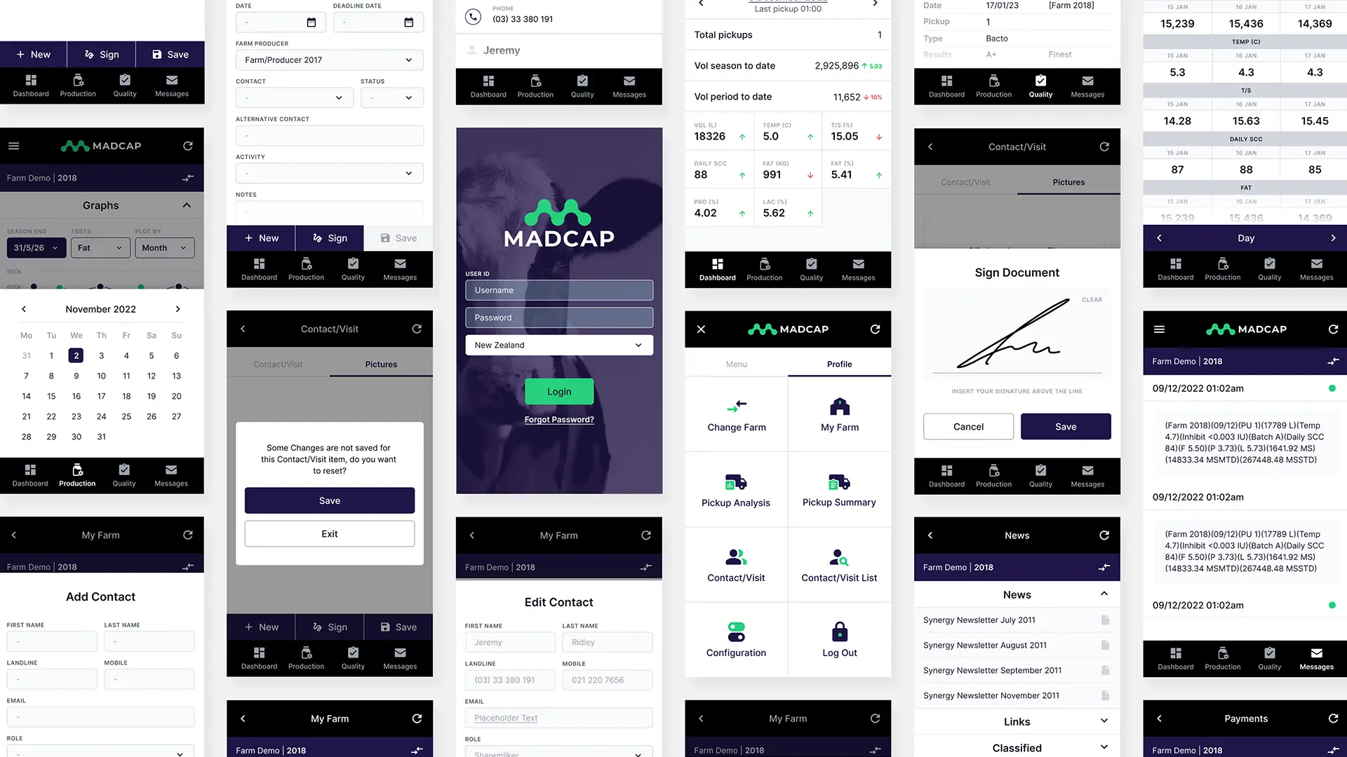
We delivered a refreshed GUI and optimised the UX/UI of the application that addressed the user’s needs. Through user interviews and user-testing, we pinpointed areas requiring attention. This included refining user-flows, reducing clicks, and conducting accessibility testing for outdoor conditions. As a part of the design process we introduced a new brand identity that would help refresh the current outdated look of the application. We applied this as well as a refreshed GUI that worked within the constraints of the Xamarin framework.
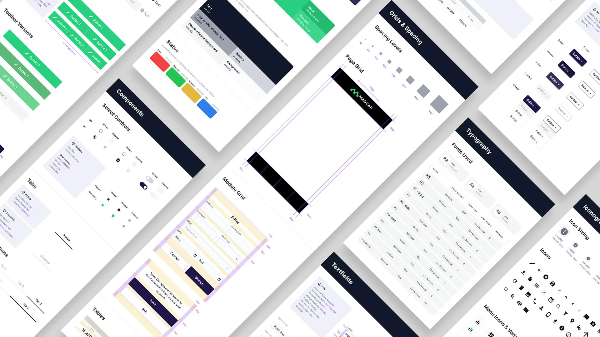
To validate our improvements, we crafted a prototype for user group testing. Additionally, a comprehensive style guide was delivered with a design system that could be used for future developments.

After screens of the application with new GUI
Results
User feedback was overwhelmingly positive, with intent from 100% of the user groups to incorporate the app into their system processes.
Although the app’s functionality remained largely unchanged, the new UI made it significantly more user-friendly. Users discovered new features they were previously unaware of, contributing to a more intuitive experience. Our work for the client improved customer retention and helped attract new customers.
Process
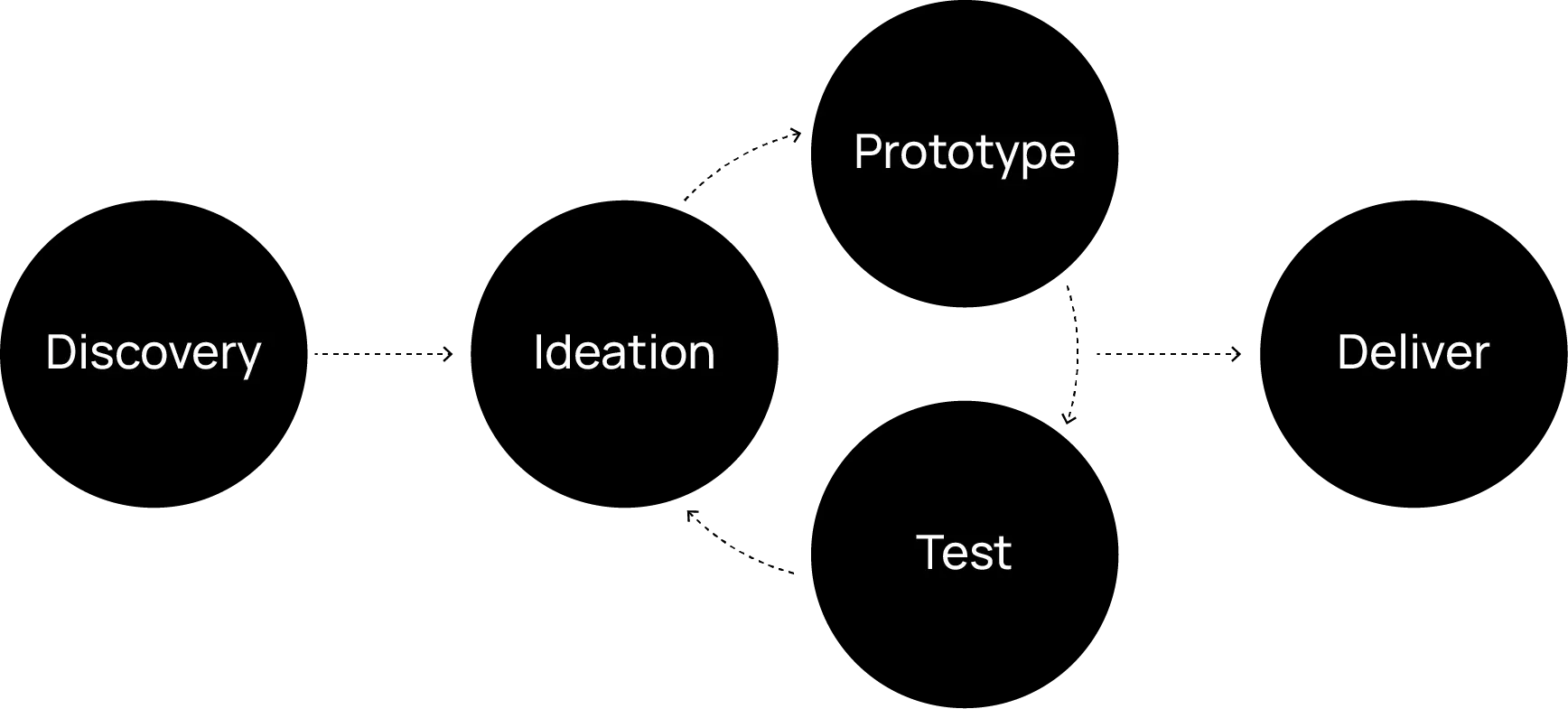
As a part of this project I collaborated closely with engineers, product managers and stakeholders. The design process followed the UX framework of discovery > ideation > prototype > test > deliver. The process has been broken down in more detail below.
User interviews
User interviews were conducted with a skew of our clients current users. Some whom had expressed interest in moving to competitors solutions. Some of the key findings included:
Limited awareness of all available app functions
Perceived as outdated and challenging to use
Uncertainty about real-time data visibility
Navigation difficulties
Preference for the desktop version due to its ease of use
Site map
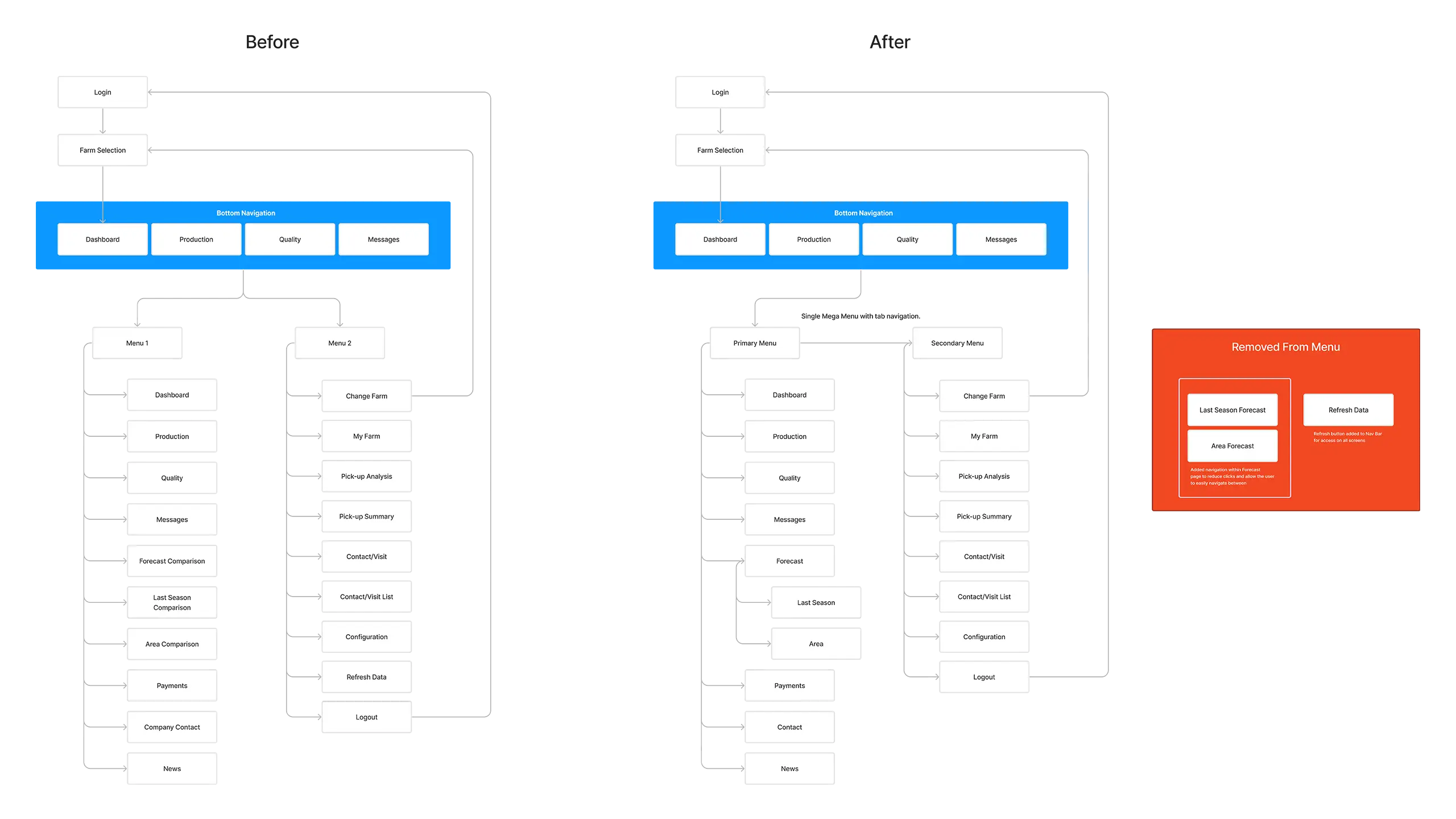
Users expressed feeling overwhelmed by information and found it confusing to navigate with two separate menus on the navigation bar. To address this, we consolidated them into one mega menu with tab navigation between primary and secondary items while key pages were made easily accessible in the navigation bar.
Low fidelity mockups
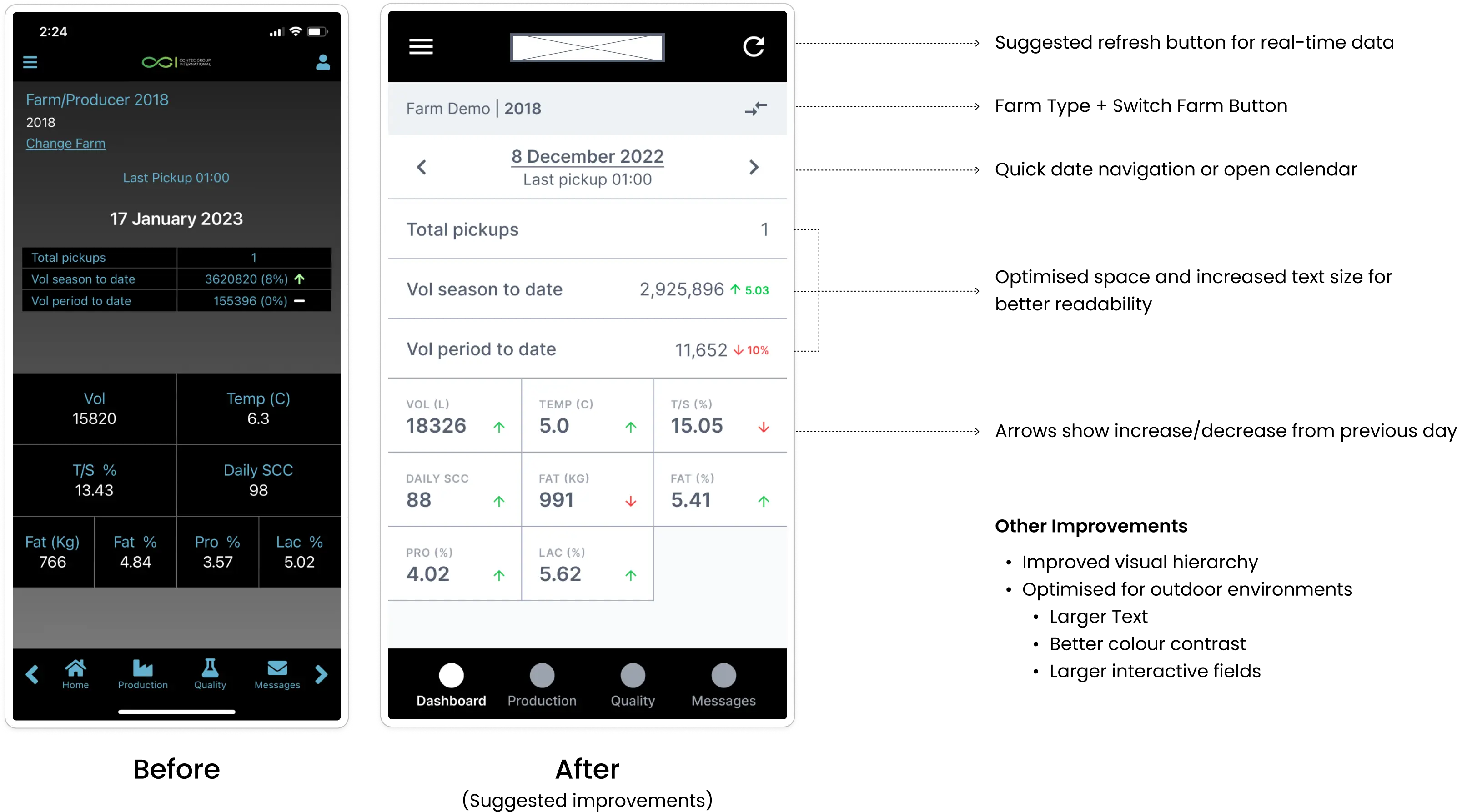
An initial concept was developed to address the main user pain points. This concept was tested to evaluate its effectiveness in resolving usability concerns. After successful validation, we proceeded to storyboard the rest of the app.
High fidelity mockups
Collaborating closely with another designer on my team, we developed and applied a new brand identity across the app. After several rounds of feedback from the client and users, we implemented the final changes throughout the app.
Prototyping and user testing
Once the client approved the high-fidelity mockups, I created a prototype for user testing. The prototype aimed to test navigation and interactions to identify any areas needing improvement or that weren’t intuitive to users. Additionally, since the product was used as a white-label solution, we needed to demonstrate that the design system was flexible for their clients. Below is an example of a prototype created for one of their clients.
Design system and guidelines
A comprehensive design system was created and documented for ongoing development of the application. This was used by the developers for the build.


